

Beautiful Data Storytelling
Beautiful Data Storytelling
What better way to understand how good data storytelling works than to explore the don of data storytelling: Spotify Wrapped.

Every December, Spotify Wrapped takes over every news feed on my timeline, eclipsing all other events.
Spotify Wrapped is a yearly recap of personal listening trends that Spotify users get showing a person’s most listened to artists and songs, new artists discovered, and favorite hyper-specific music genres. And it is magical. Spotify evolves Spotify Wrapped every year, and every year it continues to teach people about their music tastes and share what artists they love.
It looks like the Spotify team loves it, too. You can find blogs from the design team, engineering team, and data team about Spotify Wrapped 2020.

A uniquely beautiful data story.
Great data stories help people reflect and discover new ideas. Spotify Wrapped is about the individual and tells an amazing personal story of their music listening journey throughout the year.
But what helps Spotify Wrapped grab the world’s attention is the unparalleled visual experience. The design honors artist imagery and supports this data story with bold and delightful color combinations. They make sure gradients look perfect. They create powerful kaleoscope effects from album artwork. They use type in bold and impactful ways.
They only highlight a few key insights at a time to tell a clear story. Watching the Spotify Wrapped slideshow leverages animation and music that reminds me how much I love music.
Question to readers: What are comparably delightful data stories? I am hard-pressed to think of anyone else trying to create a magical data story like Spotify.
A uniquely hacked data story.
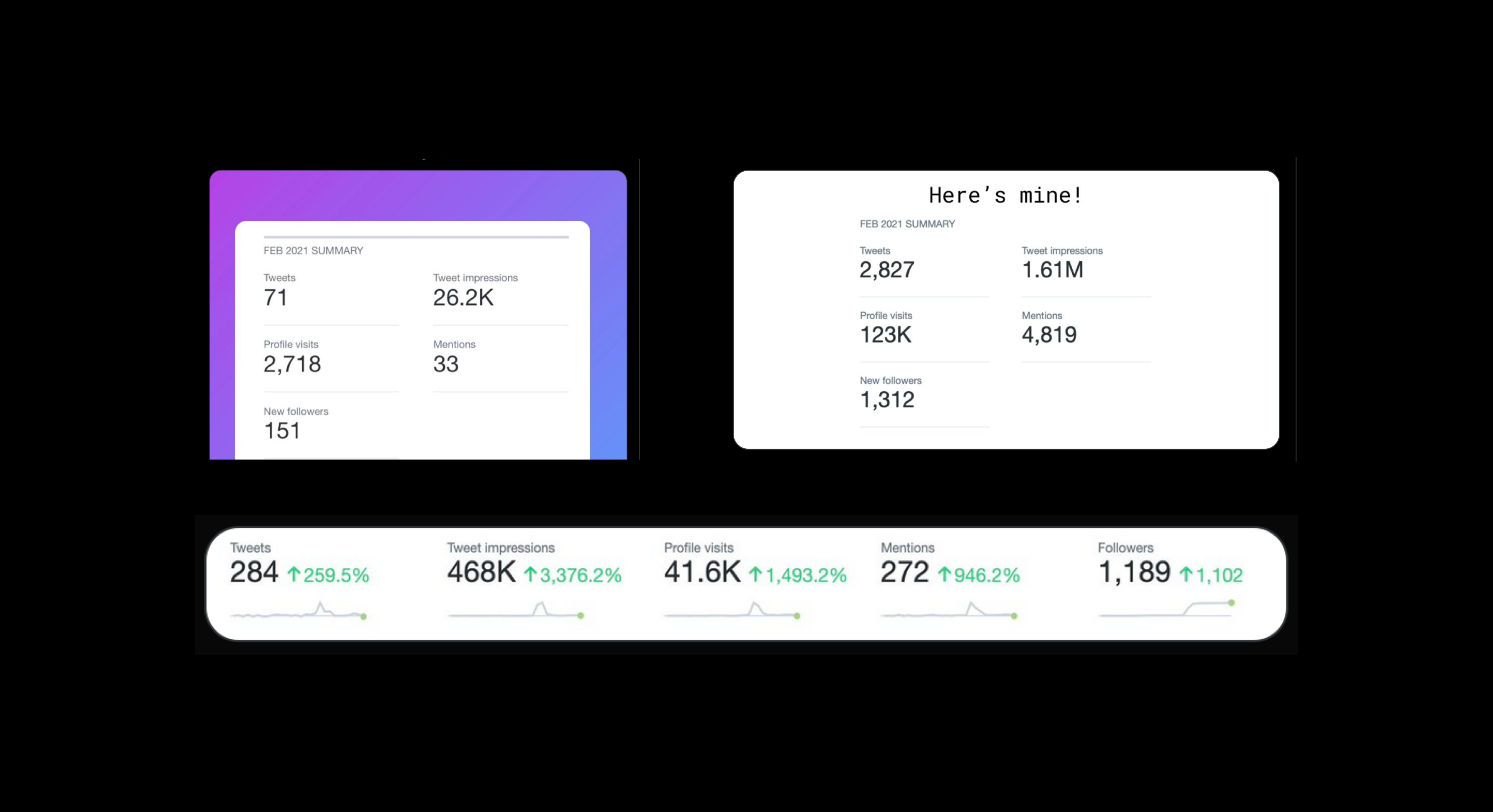
Another data story that fills my Twitter feed is monthly Twitter analytics. These data stories are less beautiful. What people do is take screenshots of Twitter Analytics and reframe their stats themselves. Generally speaking, people keep the aesthetic of Twitter Analytics which is very clear and simple, but not particularly eye-catching.
These data stories of Twitter stats are ways for people to show how things are going as they grow their Twitter following, intentionally or not. Though data stories like this can feel self-aggrandizing, as I analyzed a wide selection of them, I found something very human and authentic. People usually centered their data stories on the deeply meaningful relationships they have built on Twitter or gratitude for completely unexpected support.
What people are doing is called creating real artifacts. They are hacking a data story together in an unintended way from the original design of Twitter analytics. When people store passwords on a post-it or using tape to block a camera they are creating real artifacts. The idea is that when you find a problem people have hacked to solve, you may be on to an opportunity to solve a needed problem. By lightly photo editing their Twitter stats, they are creating a sufficient hack to be able to share their stats.
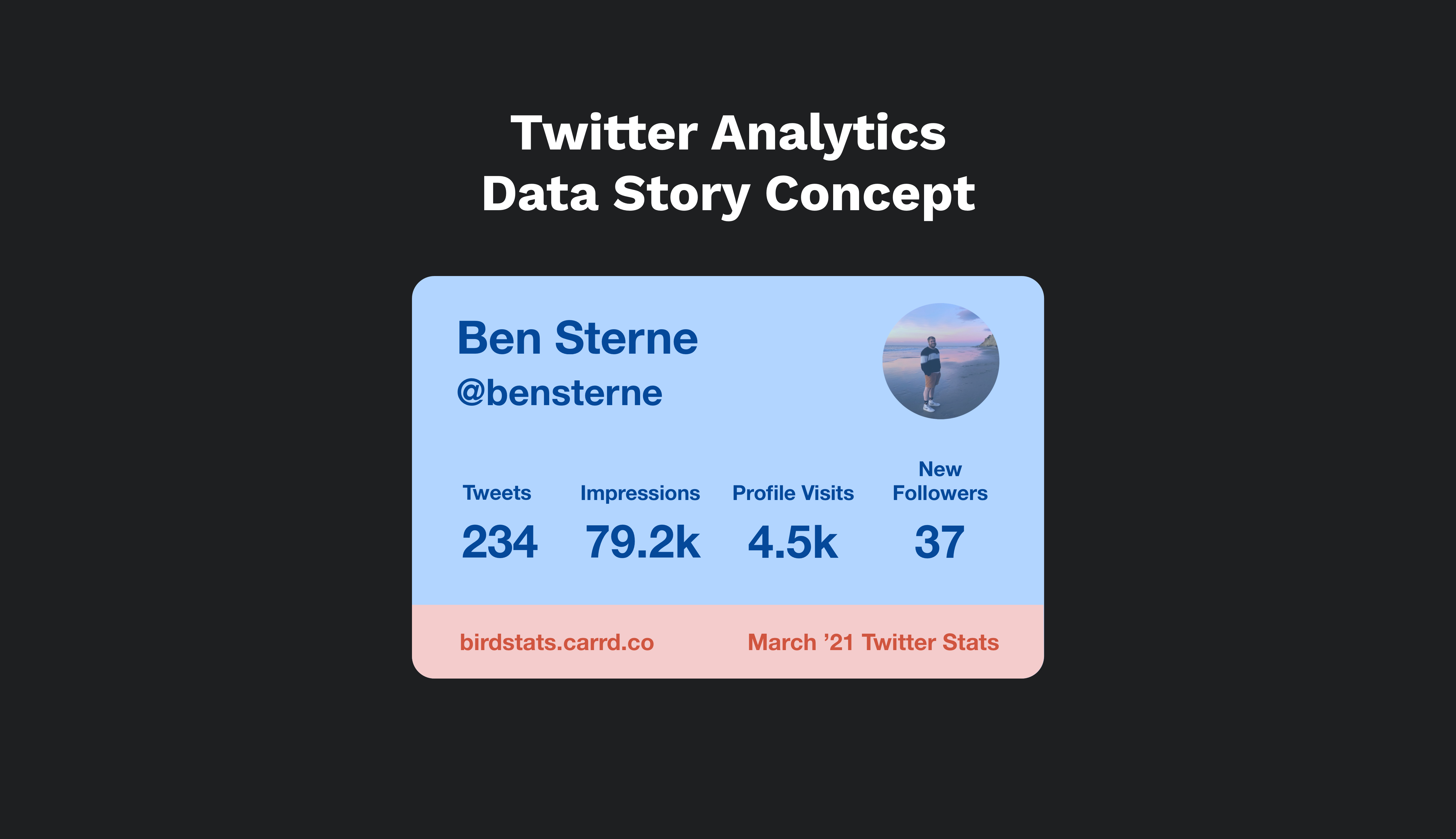
Twitter Analytics Data Story Concept
Every month when people share their Twitter stats, I see awesome data and exciting stories but felt the experience could be more engaging with more compelling visuals. I enjoy these data stories, and when people share how they grew their Twitter audience they are often trying to help others.
Twitter Analytics already shares the meaningful metrics people care about. Inspired by some of the design patterns in Spotify Wrapped, I drew up a simple concept for an easy-to-share tile using nice, eye-catching colors and minimal metrics.
If you want one of your own, I made a little website where you can make: birdstats.carrd.co
Cheers to blog #2, thanks for reading! Stoked to keep sharing with you all.
This newsletter is sponsored by → Oco Crew
This newsletter is written by Ben Sterne